| Previous | Table of Contents | Next |
Importing Captured Data Into Excel
Before we start the importing process, I want to make sure you understand a couple of shortcomings inherent in the process. First, only the object counters you selected in the chart will be exported. This is both good and bad. It is good in the sense that you did not export every single object contained in the Performance Monitor log file. Only the data you wanted was actually exported. It is bad in the sense that if you do not export all the object counters, and then you decide you want to compare a new object counter, you’ll have to rebuild the chart and export the file. The bottom line is that you should not delete or overwrite the log files you create, because you never know when you’ll want to perform a new comparison.
The second shortcoming we need to address is that, unlike the Performance Monitor that can scale individual object counters to make them more visible, an Excel chart uses a common scale. This can make your Excel charts more difficult to read. As an alternative to the common scale, I use a logarithmic scale. It is cruder, but it displays the peaks and valleys, which are what we are looking for. So, to import your data and create a chart, follow the steps presented in this section.
- 1. Use Open from the File menu command to open your exported file.
TIP: To make an exported file easy to find, specify the file type as Text Files in the Files Of Type drop-down list box in the Open dialog box.- 2. Your spreadsheet should now look similar to that shown in Figure 5.4.
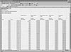
Figure 5.4 Importing data into Microsoft Excel.
In the upper-left corner, you will find a bit of information about the exported file. This information contains the date and time you created the file, as well as the location of the exported file. More importantly, though, are the start and stop dates and times of the captured data. These start and stop dates can be quite useful in determining the log file you are looking for when it comes time to compare more than one log file. Just below the start and stop dates, you will see the actual captured data, along with various labels describing the object counter and the computer it was captured on.- 3. To start the Chart Wizard, select the first cell (B13), and extend it to the end of the row (G13). Then, extend the selection by dragging the mouse (through row 313 or the end of the data) as shown in Figure 5.5.
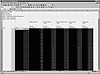
Figure 5.5 Selecting the data for the Chart Wizard.- 4. Choose Chart from the Insert menu to invoke the Chart Wizard, as shown in Figure 5.6.
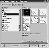
Figure 5.6 Specifying the chart type with Microsoft Excel.- 5. Select Line in the Chart Type list box. Then, specify the line chart type.
I prefer to use the first chart type for my charts, but you can choose other chart types and compare the results to find the one that best suits your needs and collected data.
TIP: Click and hold the Press And Hold To View button to get a preview of what the selected chart will look like.- 6. Click the Next button to proceed with building the chart.
At this point, the Chart Wizard should already have the cells you selected in the Data Range list box. At this time, you can modify the selected range if it is in error or if you didn’t select the range before you invoked the Chart Wizard.- 7. Once your data range is correct, click the Next button.
The dialog box, shown in Figure 5.7, should appear.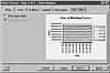
Figure 5.7 Specifying the chart properties with Microsoft Excel.- 8. Click the Titles tab, and enter a name for the chart, X label, and Y label.
If you want to change the configuration of any other items, you can choose the appropriate property sheet and change the settings. For what it’s worth, I haven’t found any reason to change the default settings other than to specify new chart titles. Of course, your settings will be dependent on your preferences and the type of data you are viewing.- 9. Click the Next button.
The final dialog box should be displayed. I prefer to create a new sheet, as shown in Figure 5.8, for my chart to keep from cluttering up the worksheet. But, if you prefer, you can leave the default entry (As Object In) selected.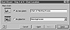
Figure 5.8 Specifying the chart location with Microsoft Excel.- 10. Click the Finish button to create your chart.
Your chart should appear similar to the chart shown in Figure 5.9. If you look closely, you will see that the chart is missing a few items. Specifically, the chart legend is wrong. It says Series X where it should have real names for each entry. And the Page Faults per/sec. entries are not even visible. I’ll show you how to correct these little problems in the next sections.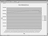
Figure 5.9 The chart created with Microsoft Excel Chart Wizard. - 2. Your spreadsheet should now look similar to that shown in Figure 5.4.
)
)
)
)
)
)
Adjusting The Chart Legend
So, what can you do about this chart legend problem? Well, you can set it right by specifying the location of the legend titles. To do so, follow the steps presented here.
- 1. Right-click on the chart, and choose Source Data from the pop-up menu.
The Source Data dialog box, shown in Figure 5.10, should appear.
Figure 5.10 Specifying the chart labels.- 2. Select the legend title in the Series list box. By default, this is Series1 through SeriesX.
- 3. In the Name field, enter the cell location that contains the title. In our example, this is cellC8 in sheet MemHogProcess. The syntax to convert this into a form understood by Excel is =MemHogProcess!$C$8.
TIP: If the steps presented to change the legend are too confusing, there is an easier way. Just select the icon on the right of the Name list box. This will bring up the Source Name—Data dialog box. Once this dialog box displays, select the sheet to use from the bottom status bar. Then, find your title cell, and double-click. This will put the correct formula into the Source Name—Data dialog box. Click the icon on the far right again. You will see the Source Data dialog box with the correct formula entered, and the Series list box will now display the correct label.- 4. Repeat Step 3 for each item listed in the Series list box.
- 2. Select the legend title in the Series list box. By default, this is Series1 through SeriesX.
)
The preceding series of steps will fix your legend, but the steps won’t correct the other small problem regarding data display. If you can’t see all your data, you will need to modify the scale for the Y axis.
| Previous | Table of Contents | Next |